


My three favourite mood-board items of the moment,
a big decision, and negotiating with nostalgia

Well thank you for nothing, Messieurs Macron, Barnier and Bayrou. On top of causing delays (four months in my case) the new French budget has so altered grant awards for MaPrimRénov energy-efficient renovations that I am calling it a day.
After a gruelling six month process, assisted by my lovely, if slightly awkwardly named, government-appointed coach, Monsieur Pornot, my grant was pre-approved early December 2024, with completion of work all set for autumn 2025. It was considerable, covering 80% of the cost of: heat pump central heating, new double glazed doors and windows throughout the house, a new fireplace and wood burner, insulation and ventilation. My home would be so eco-cosy! But the adjacent costs (electricity, plumbing, structural and decoration changes) are still quite a lot for me, and if you do not commit to a major project - “Projet d’Ampleur’ - rather than cherry-picking one item, you aren’t eligible for the grants. It’s a super expensive chicken and egg, yet highly worth it - up to a point.
Dear Reader, I have reached that point. And the point is, getting a life.
The thought of the house in turmoil for what would now, post new-budget, be another eighteen months, with all the mud, dust, noise, invasion and inevitable crises is bad enough, but after the great fusebox disaster of last week, I decided to give myself the loving gift of No More Mediocre Workmen.
Adieu then, MaPrimRénov. No more major structural or eco-renovation for me. I want my house and my life back, so I’m skipping straight to the (relative) joy and simplicity of decoration in the main house and garden.
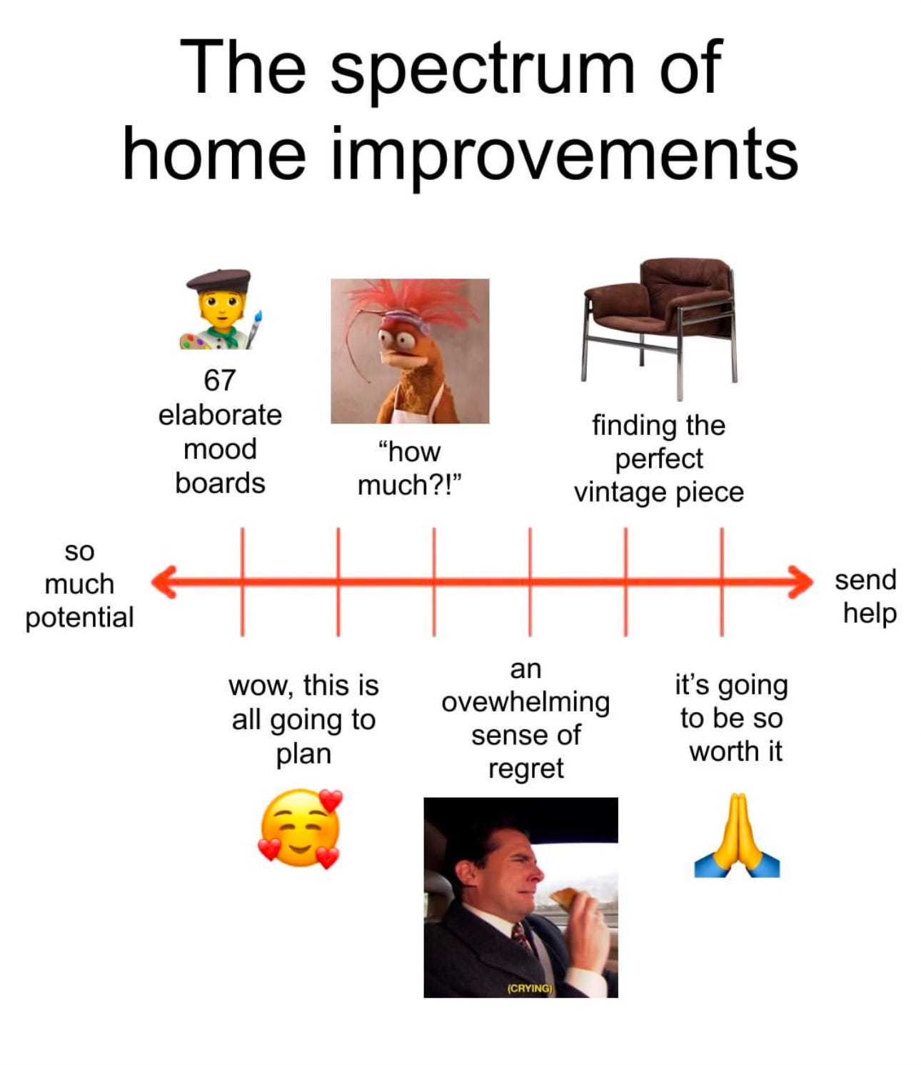
Which leaves me fully immersed in mood-board Narnia, soaking my eyes and imagination with fantasy colours, textures and forms. Everything here is harmony, magic and beauty, until, sensibly, I make my way back through the fur coats and into the value-engineered reality of Ikea, Le Bon Coin and most of all, everything I already own. I’m hoping some of the moody wonder will rub off and translate into a home I will love to use AND look at.
My three favourite mood-board items of the moment
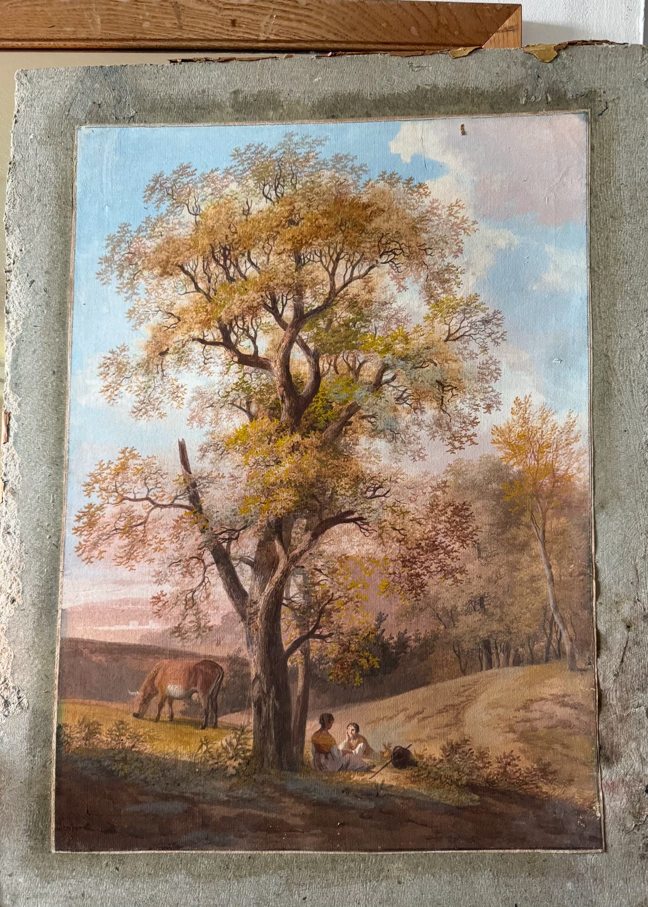
I recently found this 18th gouache in my (excellent) local antique shop and it’s become my palette for the future sitting/dining room/office/photo studio - ocre, chestnut, terracotta and pale blue. My dilemma, how could I paint the walls one of these colours? The problem with that is the need for half the room to be used for photos for my books and other work. Anything other than white or off-white might make for tricky colour reflections. Thankfully all the pieces of mostly mid & late 20th century furniture I’ve selected for this room fit into the colour scale. À suivre.

I am completely obsessed with the colours in this gorgeous image, one of a series by Swiss photographic artist, Constance Jaeggi O’Connor on the women riders of the Mexican Escaramuza charra : synchronised riding to music, side saddle and in magnificent costumes. (Here’s a short film about the sport.) A few people have called the blue on the dresses turquoise, but I don’t find it quite that green? I’m trying to work out where in the house I can use this combination, and in anticipation, ordered this lovely piece from Zara’s excellent new collection.
It seems mad, but it’s been about thirty years since I’ve decorated my homes with colour. Back in the nineties, I covered the bedroom walls of my first French home with fabrics by Pierre Frey (Panier Fleuri - now in wallpaper) the sitting room with Manuel Canovas, (discontinued Perlimpinpin) and painted the walls of my kitchen in dark blue gloss paint to set off the blue and white Delft tiles. Since then, it’s been creams, greys, black and white, with lots of neutral “industrial” textures in wood and stone. Suddenly, this all seems so safe, although, just like art on the walls, I am always wary of tiring of anything too static containing too much colour.
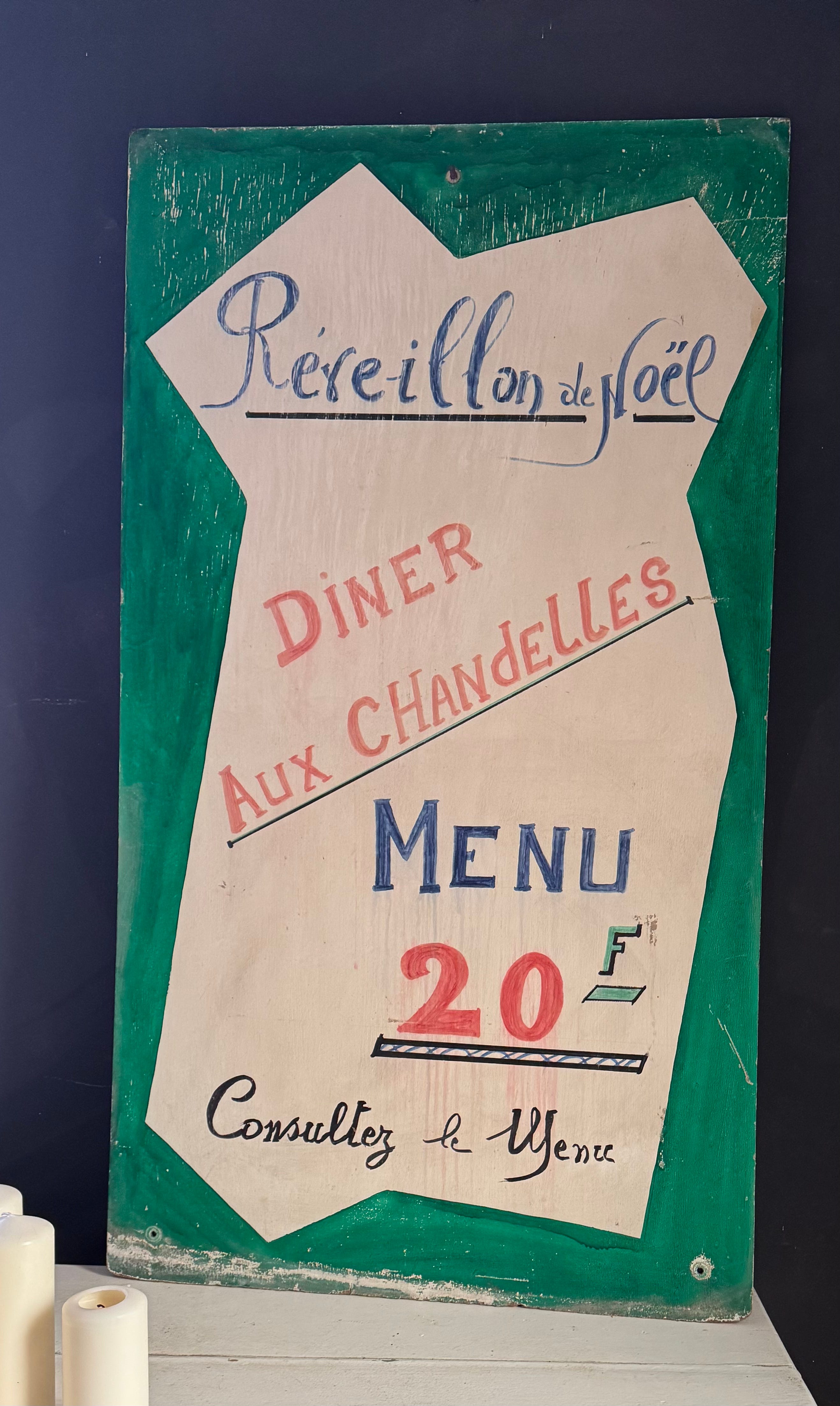
Which brings me to my latest objet de desire, this hand-painted sign for a bistrot Christmas menu, again from Longny au Perche antique shop. I don’t know why, but can’t keep my eyes off it. It’s the colours, for sure, and also the random fonts, and underlying it all, the romantic promise of a candlelit Christmas Eve dinner. I just have to figure out where it should go, and then riff on the colours in the rest of whatever room that might be.
Thankful that walls and windows will no longer be ripped out of my little home before I can even begin to think of how they might be dressed (even if it did mean living in a properly grown-up house at last) I’ll happily keep you posted.